Grid Alignment!
grid-template: "a b"
"c b"
"d d"
"e e";and I work at Google.
...or at least, some of it.
Defines several useful image-related features.
Should enter Last Call this month, and CR by early next year!
linear-gradient(to top left, red, white, blue);
radial-gradient(5em circle at top left, red, white, blue);
image() functionBasically a souped-up url()
background: image("foo.webp", "foo.svg", "foo.png", blue);
background: image("arrow.png" ltr);
background: image(rgba(0,0,255,.2)), url(foo.jpg);
image-resolutionimage-orientationrotate() transforms.object-fit, object-positionRevival of an old 2003 spec
::marker pseudo-element@counter-style leaves {
type: repeating;
glyphs: url(leaf1.jpg) url(leaf2.jpg);
}
@counter-style binary {
type: numeric;
glyphs: "0" "1";
}
@counter-style dice {
  type: additive;
  additive-glyphs: 6 ⚅, 5 ⚄, 4 ⚃, 3 ⚂, 2 ⚁, 1 ⚀;
  suffix: ’‘;
}
⚀    One
⚁    Two
⚂    Three
...
⚅⚄   Eleven
⚅⚅   Twelve
⚅⚅⚀  Thirteen
Basically, display:block for applications.
Dumps much of the text-related complication in favor of simpler, more useful abilities.
Is nearly done being rewritten right now, and is currently being re-implemented in Chrome (other browsers should follow shortly).
Combining an input and a button
<div style="display: flexbox;">
  <input style="width: flex(); display: block;">
  <button>foo</button>
</div>
Horizontal navigation bar
<style>
  ul { display: flexbox; }
  li { width: flex(); }
  li.fixed { width: 200px; }
</style>
<ul>
  <li><a>Products</a></li>
  ...
  <li><a>Training</a></li>
</ul>
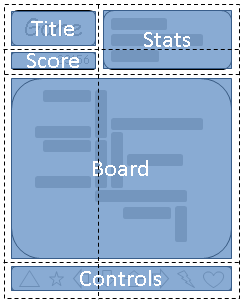
Finally, a layout system designed for pages.
Slice the page into cells, and position elements into those cells.
No extraneous markup, no source-order dependence, fully flexible.
grid-template: "a b"
               "c b"
               "d d"
               "e e";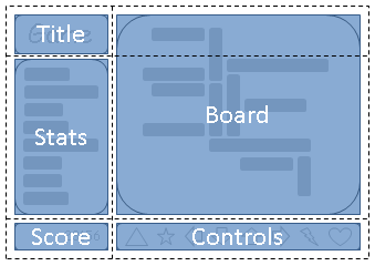
grid-template: "a d"
               "b d"
"c e";http://dev.w3.org/csswg/css3-values/
This spec defines all the basic value types that CSS uses across its specs
Also defines the syntax used in property descriptions, if you ever wondered what the hell "&&" meant in a spec.
rem is the em from the root element
ex is relative to the font's x-height, similar to the em
ch is the width of the "0" (an 'average character')
vw, vh units are relative to the size of the window
Lets you do math in CSS, combining things that are comparable
calc(50% + 20px)
calc(100% / 7)
attr() lets you pull values from attributes on the element
Useful for implementing the UA stylesheet, or for styling based on data-* attributes
width: attr(data-size as px, 100px);
cycle() takes several values, and "cycles" between them with each nested use
em { font-style: cycle(italic, normal); }ul { list-style-type: cycle(circle, square, dot); }http://dev.w3.org/csswg/selectors4/
The first module to hit level 4!
Selectors are getting pretty powerful now
In HTML, the column of a cell is indicated implicitly, rather than directlly through nesting. This makes it impossible to style an element based on its column, except for the 4 properties that the spec allows <col> to have.
td:col(col.foo) selects the cells within the column that matches "col.foo"
td:nth-col(n) and td:nth-last-col(n) work in the expected way
:any-link is :link done right - matches both visited and unvisited links
:local-link matches links to elsewhere in the same page
:local-link(n) matches based on subsets of the path - :local-link(0) looks only at the domain, :local-link(1) looks at the domain and the first segment of the path, etc.
Only useful for presentation formats that are time-based, like karaoke captions in an HTML <video> or a screen reader
:current matches the current active element
:past and :future matches elements that have already been passed, or haven't been hit yet, respectively
video::cue(:past) { color: red; }
video::cue(:future) { color: white; }
/* Bouncing ball left as an exercise for the reader */
Lets you follow IDREF attributes in the selector, like <label for=foo>
label:hover /for/ input { outline: thick dotted red; }
Questions and Answers
Variables! In CSS! OMG!
A common request for literally over a decade.
Previously, discussion was paralyzed by indecision and argument.
Now we have agreement on the solution, and are starting experimental implementations.
:root {
	data-header-color: #006;
	data-main-color: #06c;
	data-accent-color: #c06;
}
a { color: data(main-color); }
a:visited { color: data(accent-color); }
h1 {
  color: data(header-color);
  background: linear-gradient(data(main-color), transparent 25%);
}Stylesheets often have tons of repetition in the selectors.
"#main > header > h1", "#main > header > h1 > a", "#main > header > h1 > a:visited", etc.
Verbose, hard to read, prone to hard-to-see errors
#main > header > h1 {
  font-size: 2em;
  background: blue;
  color: white;
}
#main > header > h1 > a {
  color: #ddf;
}
#main > header > h1 > a:visited {
	color: #fdf;
}
#main > header > h1 {
  font-size: 2em;
  background: blue;
  color: white;
  & > a {
    color: #ddf;
    &:visited {
      color: #fdf;
    }
  }
}
Just syntax sugar for the long-form stuff.
Again, CSS preprocessors led the way.
Shorter stylesheets, better organization mean faster app development.
Explicitly indicates scoping opportunities, which might be useful for browser perf
Questions and Answers